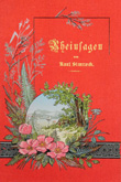
Cover Design
In the early part of the 19th century book cover design was somewhat restricted. Constrained by the tools and technology available to them, book-binders used hand-held, heated brass and iron rolls and stamps to decorate leather covers and spines. The roll, comprised of a wooden handle attached to a wheel with a continuous, engraved circumference pattern, was used to produce lines of ornamentation or borders of flowers and leaves. The most common of the rolls was the “fillet” which produced simple, straight lines; often singular but sometimes up to four parallel lines. Similarly, the stamp with its slender wooden shank and brass attachments with engraved lines, dots, letters or pictorial designs, was used to adorn a book’s corners or spine. Pallets and gouges, also lining tools, were used to create short lines (usually over the spine) or curved, semi-circular lines; the latter of which can be seen on the cover of The Martyr of Erromanga in cabinet 1. These finishing tools were manufactured in standard patterns and their very nature restricted cover decoration to a sort of geometric arrangement, with the odd floral corner embellishment. As a result, early 19th century cover designs were hand-tooled in a purely decorative manner. In no way were they related to the contents of the book.
This all changed with the cased-in cloth binding of the 1830s which saw covers constructed separately from the textblock. Gone was the restrictive five or six-compartment spine with its raised bands and limited space for imaginative decoration; in was the Imperial Arming Press (1832), with its lever-operation, capable of accommodating larger metal stamps and impressing blind, gold or coloured ink into the designs. Examples of designs and titles blocked in black ink appeared as early as the 1840s but were more common towards the end of the 1850s, when black was used in conjunction with gold to bring depth to a design. The 50s also saw the introduction of the paper onlay. These were usually paper cut-outs in contemporary colours, which were then blocked in gold and affixed to the centre of the cloth cover. Occasionally they were chromolithographs, laid down on the cover for pictorial effect; a popular style associated with the 1860s.
Designers of the 1860s also embraced colours other than black. Initially red was used to highlight titles stamped in black and gold. By the 1870s it was common to see entire covers blocked in vibrant reds, greens, blues and even shades of orange, brown and grey. Classic examples of colour blocking can be seen on Wood’s Natural History books in this cabinet. The shift in design from purely decorative to pictorially relevant is also evident around this time, with cover illustrations blocked in gilt in a manner reflective of the book’s contents. At times, the cover image was an exact replica of one that appeared inside the book. Fine examples of gilt pictorial stamping can be seen on the covers of Half Hours in the Far South, Jottings from the Pacific and Glimpses of Maori Land in cabinet 5.
The 1850s and 1860s also saw the emergence of one of the most recognisable, perhaps even iconic, features of the publisher’s cloth binding - the embellished title block. This solid block of gold at the head of the spine acted as a title compartment, drawing attention to the encapsulated lettering which, in turn, stood out in relief. By the 1880s these title blocks also appeared in silver, when aluminium was found to be a reliable form for blocking. Titles were blocked on the cover too and, at times, more of the cover was gilt than cloth. Indeed, the blocked recessed cover panel became somewhat of a hallmark for Frederick Warne & Co., publishers of the Lansdowne Poets series, as seen on The Poetical Works of S.T. Coleridge and The Poetical Works of Longfellow in cabinet 8.
By the 1890s the title block and the pictorial cover illustration had morphed into something quite different. The Art Nouveau style, most popular between 1890 and 1910, began to appear on book covers and spines in the form of stylised leaves, vines and flowers. Other objects, recognisable although non-realistic, also appeared in the designs but the botanical influence was recurrent. Artists, who had previously illustrated the book’s contents, were now being engaged by publishers for the purpose of cover design. Many were influenced by architects, furniture and textile designers, stained glass designers, ceramists and other decorative artists of the era, with covers taking on the immediately distinguishable whiplash curves of the natural world. Nowhere is this nature-inspired design more evident than on the covers of Fra Angelico, Life of William Blake and A Kentucky Cardinal, each displayed in cabinet 7.


